单行高度
一行文字的高度等于 font-size 乘以 line-height
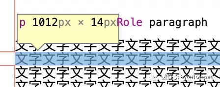 font-size: 14px, line-height: 1
当行高设置为 1 时,行高度是:
14 * 1 = 14px
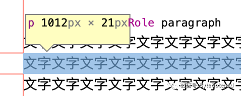 font-size: 14px, line-height: 1.5
调整到 1.5 时,行高度是:
14 * 1.5 = 21px
文字行内间距
文字在一行里的上下间距等于 font-size * (line-height - 1) * 0.5
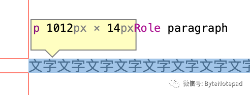 line-height: 1
行高设为 1 时,文字上下没有间距,调到 1.5 倍以后的效果:
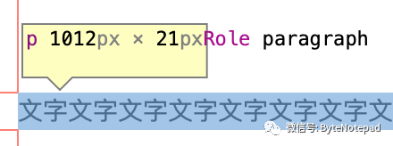 line-height: 1.5
行高变成了 21px,文字上下间距是:
(21 - 14) * 0.5 = 3.5px
用字号和行高的关系计算出间距:
14 * (1.5 - 1) * 0.5 = 3.5px
多行文字
总高度 = 单行高度 * 行数
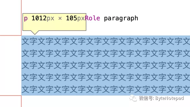 font-size: 14px, line-height: 1.5
5 行文字的高度是:
14 * 1.5 * 5 = 21 * 5 = 105px
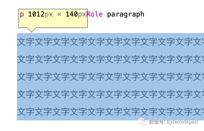
行与行之间的间距是:
14 * (1.5 - 1) = 7px
行间距和字号计算行高的方法:1 + 行间距 / 字号 = 行高
1 + 7 / 14 = 1.5
行高带来的排版问题
文本在行内部上下的间距,随着行高的增加会变得更加明显。
 font-size: 14px, line-height: 2.0
当行高设置为 2 倍时,上下空白的间距达到了 7px,这个距离会拉大文字和上一个元素的间距。
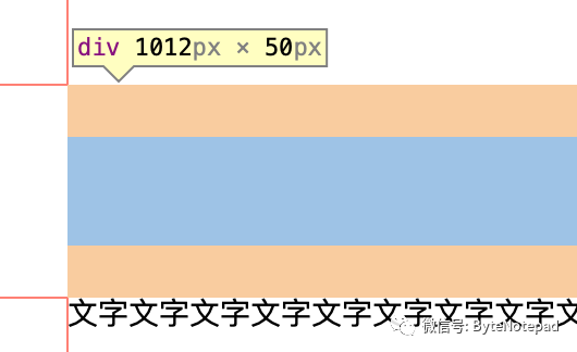
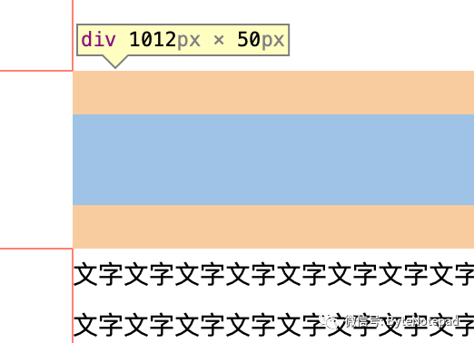 div 的 margin-bottom: 24px
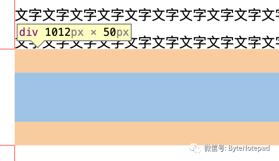
文字和上一个元素的实际间距就是 24 + 7 = 31px,期望的排版效果是下面这样的:
 期望的效果
期望的效果
解决方案
利用外边距折叠(Collapsing Margins)可以解决这个问题。
使用字号和行高可以计算出上下的空白间距,字号 14px、行高 2.0 ,那么间距就是:
14 * (2 - 1) * 0.5 = 7px
那么只要给文字的 ::before 伪元素设置 margin-top: -7px,在外边距折叠效果下文字就会上移 7px,刚好就消除了上间距。
对于底部空白边距,就给 ::after 伪元素设置 margin-bottom: -7px,让下面的元素位置上移 7px,就可以抵消下间距。
看一下 CSS 代码和效果:
.markdown-body > p::before {
  content: "";
  display: block;
  width: 0;
  height: 0;
  margin-top: -7px;
}
 ::before margin-top: -7px
.markdown-body > p::after {
  content: "";
  display: block;
  width: 0;
  height: 0;
  margin-bottom: -7px;
}
 ::after margin-bottom: -7px
(全文完)
